

A new day…
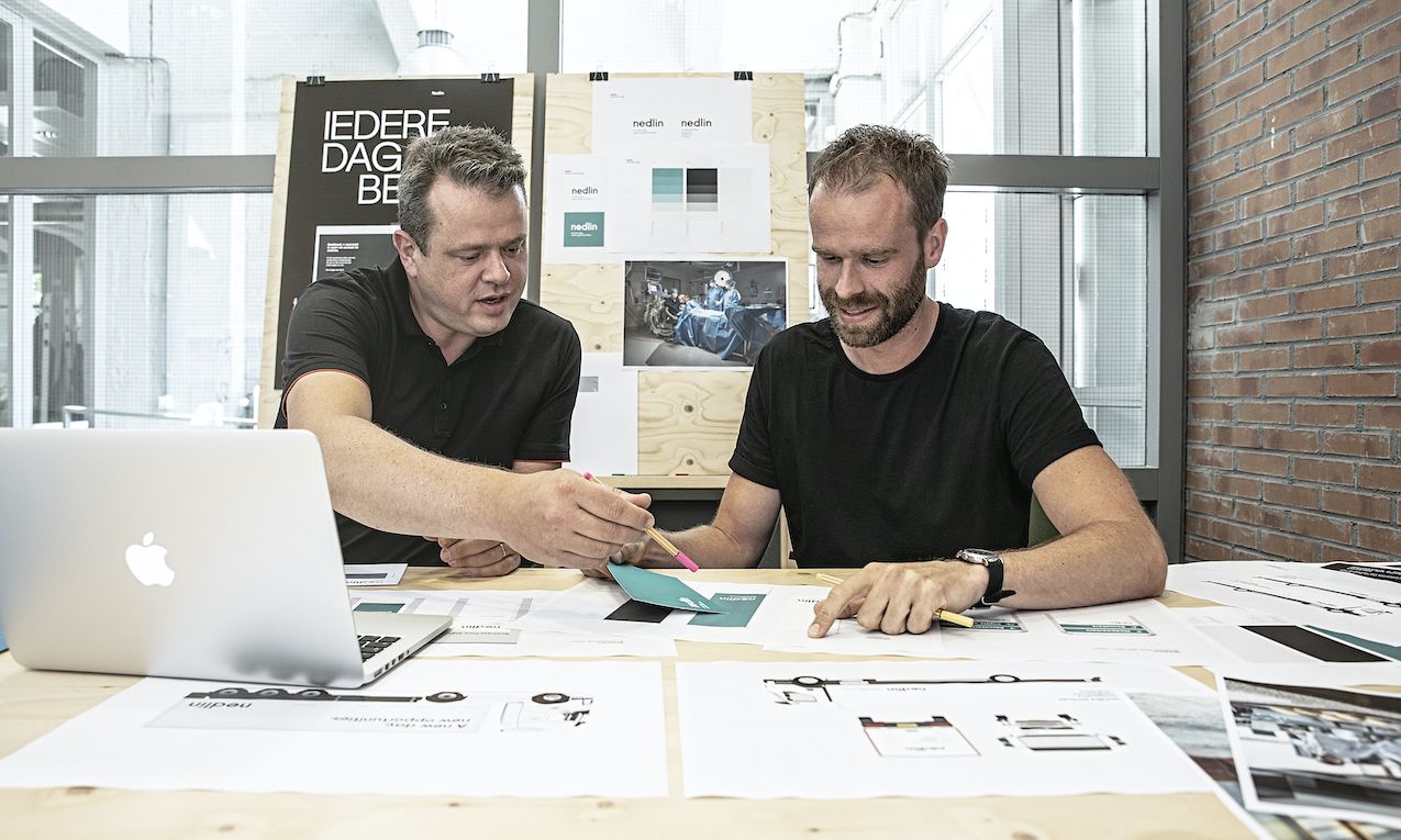
Leading up to 2017, the year Nedlin celebrates its 65th anniversary, the company thoroughly examines its own identity. Returning to its roots while focusing on the future, the company, then operating under two names, seeks an effective and sustainable communication strategy.
After a thorough examination of its brand architecture conducted by communication consultancy viaStory, Nedlin consolidates its strengths under one name. This decision is a logical choice because, despite operating in various segments (hospitality, healthcare, and industry), Nedlin is fundamentally a family business. Director Luuk de Win stated, "We wanted to strengthen our unity. The name Nedlin is familiar and trusted to us, as our hospitality laundry has borne this name for years."
However, the existing corporate identity and communication tools no longer align with the current Nedlin. Therefore, a comprehensive rebranding effort is undertaken in collaboration with viaStory.
Four steps to the new Nedlin:
- The Story
- The Logo
- The Branding
- The Magazine
Now the entire comprehensive picture is accurate, right down to the smallest details
1. The story
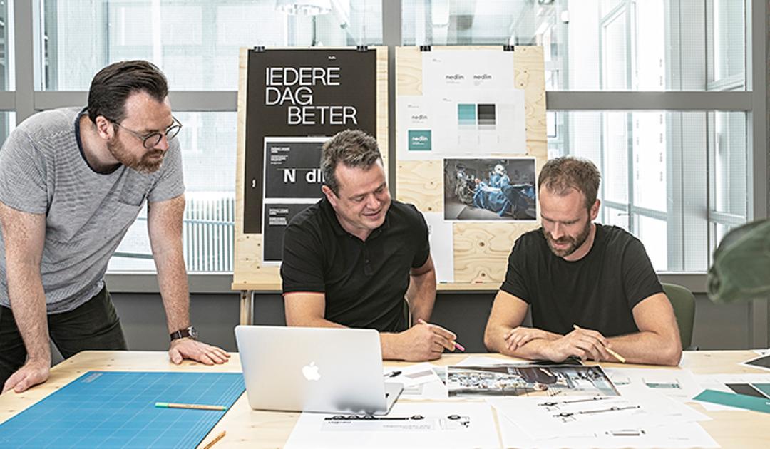
The consolidation under one brand with a clear positioning presents new opportunities. However, before focusing on the re-branding of the new Nedlin, the company, guided by viaStory, embarks on defining the guiding principles that characterize Nedlin. Based on extensive research, which allows contributions from employees across all levels of the company, the story of Nedlin is developed.
The input gathered from these discussions provides insightful perspectives, highlighting the organization's strong drive for achievement and a culture that consistently strives for improvement. This drive is truly embedded in the company's DNA. While this can be challenging for employees at times, it is also perceived as the driving force within the organization. This forms the foundation for Nedlin's story, framing this strength under the motto 'Every Day Better' to foster a positive sentiment. An optimistic outlook that reflects the company's commitment to performance and innovation.
2. The logo
Nedlin operated under two names before, but the old Nedlin's visual identity did not align with the company's true identity. Luc Wassen from viaStory explains, "After delivering the Story platform, including Nedlin's narrative, the challenge was to translate this into the visual identity. The logo represents the company's DNA, culture, and ambition. The old logo no longer captured this and was associated with outdated communication."
Initially, efforts were made to restyle the existing logo with the water droplet. This was scrutinized with designer Ivo Straetmans. "Upon review, we noticed that the droplet and wordmark were not well-crafted," Straetmans elaborates. "Curves weren't smooth, the wordmark alignment was off, and it lacked the precision and refinement befitting Nedlin."
After initial sketches aimed at presenting the droplet in a more modern manner, Nedlin's management decided to eliminate the droplet altogether. This decision was partly based on business considerations. Nedlin constantly aims to set new standards in its industry. If everything needed a restyling, it was decided to opt for a new standard in quality for the visual identity. Luc Wassen remarks, "The droplet logo was too stigmatizing for an innovative company like Nedlin. The same applied to the color blue, commonly used in the industry but overly conventional."
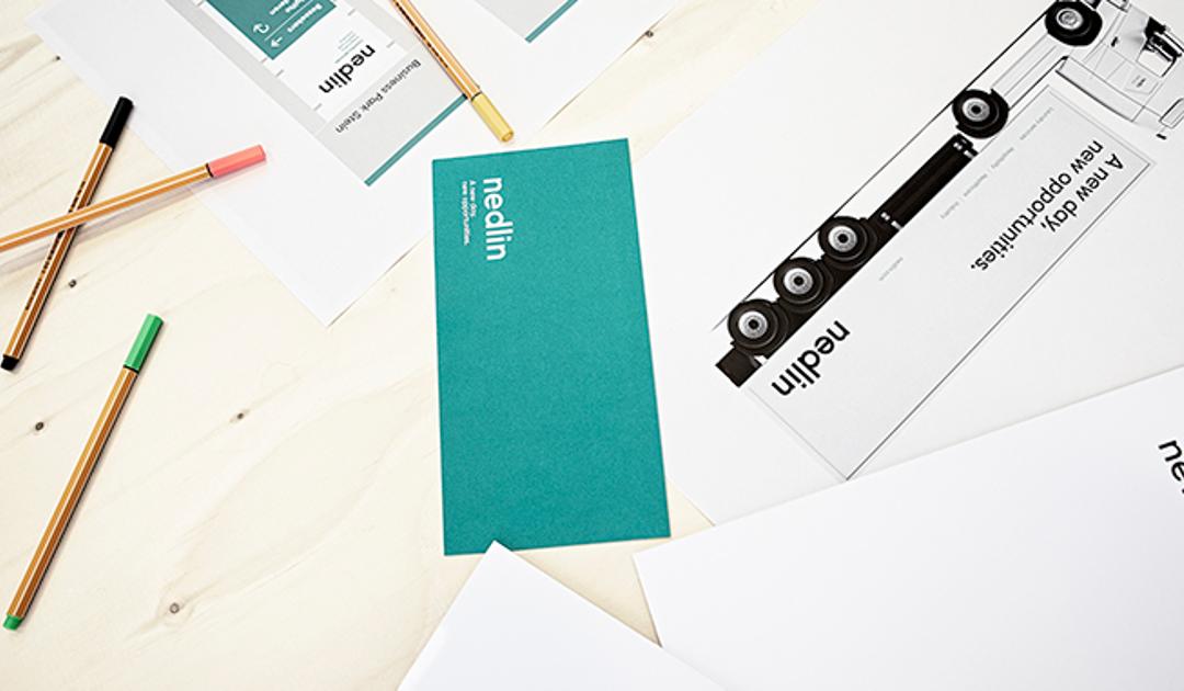
The final result is a wordmark in black with a new supporting color in green. Luc Wassen explains, "The logo has been stripped down to its essence. It stands solidly on its own. The green color is distinctive, offering a clean and almost pristine appearance. This minimalist style provides ample space to convey the substantive story. Images and photos used on the website, for instance, are showcased effectively."
Luc Wassen emphasizes that the new logo is designed to be timeless. "It's a sustainable emblem exuding precision. It's not fleeting or trend-sensitive. With this logo, Nedlin can move forward for generations to come."
3. The branding
viaStory translates 'Every day better' to 'A new day, new opportunities'. Luc Wassen explains, "Not only because Nedlin operates in various countries and needs to appeal internationally, but also to reflect optimism." Each day brings new opportunities, insights, and energy. This forms the basis for the complete re-branding of the company.
Visitors to Nedlin's website now encounter a clear, stylish, and timeless presentation. The new online environment not only provides essential information about products and services but also emphasizes Nedlin's innovative character. Furthermore, there's a strong focus on the company's societal relevance, highlighted by a prominent film featuring Nedlin's customers in leading roles. Additionally, editorial articles are strategically placed to provide background on the family business and showcase the broader world of Nedlin.
Of course, branding extends beyond online presence to encompass items like uniforms, trucks, signage at all locations, facade lettering, apps, and company presentations. Luuk de Win expresses great satisfaction with the outcome, stating, "With two different names, our visual identity never really came together. Now, the entire image is cohesive, down to the smallest details."
4. The magazine
In addition to online articles, Nedlin develops a printed magazine to showcase its values and priorities as a company. This medium not only keeps stakeholders informed about the latest developments within Nedlin but also offers insights into what motivates other customers.
The chosen typeface for the brand identity, Gilroy, takes center stage in this magazine. Designer Ivo Straetmans opted for Gilroy for its versatility, maintaining its impact both online and offline. "This typeface is solid and tidy, yet it also exudes openness and a positive vibe."
Certainly, the typeface is used across other platforms such as the website, trucks, or business cards, but the magazine exemplifies its versatility. "A magazine allows us to explore different sizes and weights of the typeface, utilizing all its variants to the fullest," explains Ivo Straetmans. "For instance, the serif type is excellent for displaying quotes, evoking a narrative style."
Apart from the annual print edition, the online magazine regularly publishes new articles about Nedlin's world and its collaborations with customers. Most importantly, every day, Nedlin's employees engage in dialogues with customers to continually enhance their performance together.
Interested in receiving the print magazine? Send an email to magazine@nedlin.com